Last week, I completed the animation drawings, and now I need to focus on the UI. In rhythm games, good UI animation can provide players with excellent rhythm feedback. So, I plan to spend some time on the UI effects to give players the best possible gaming experience.
Edit one week later: After implementing the initial UI effects, I realized that the UI style felt like a default template, lacking any real sense of design. So, I plan to redesign the UI.
The first version of the UI:
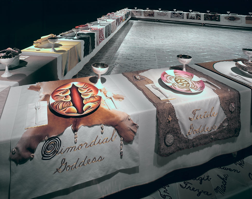
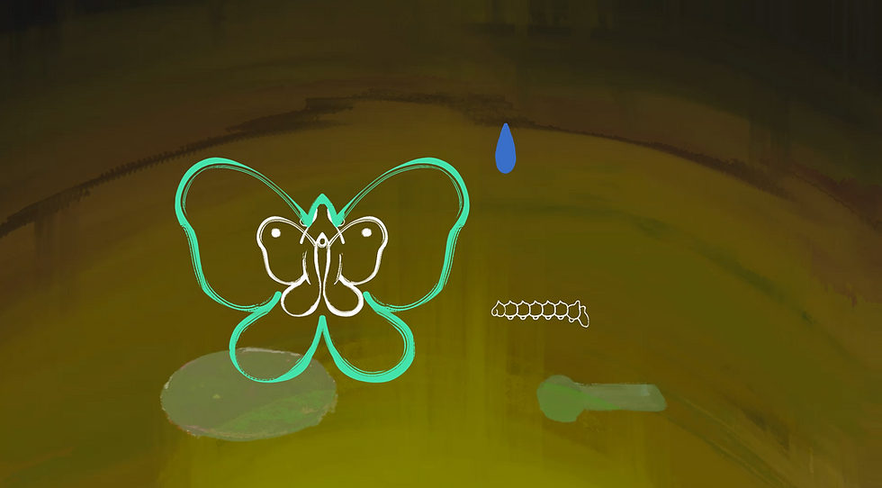
In the new design, I will focuse on incorporating feminine elements, aiming for the UI to engage more deeply with the game’s feminist narrative, rather than just being a collection of culturally empty circles and lines. I drew inspiration from Judy Chicago's The Dinner Party, where she incorporated female genitalia into art. I fused the shapes of female genitalia and a butterfly to create a new circular UI. For the linear UI, I used the imagery of a caterpillar. The combination of the caterpillar and the butterfly also symbolizes Voleria's growth.
I implemented a rough draft of the initial effect in Unity. When the new design was placed in the overall scene, I found it still felt a bit out of place. Then, a new idea came to mind: why not treat the UI as part of the illustration and fill the inner outlines with color? This way, the entire scene would be unified under the same illustration style.
After an entire afternoon of trial and error, I finally achieved a result I’m satisfied with. To get this result, I spent a lot of time experimenting with whether or not to use an outline, the thickness of the outline, the hue and brightness of the colors, and the intensity of the hand-drawn feel in the brushstrokes. In the end, I chose a design with a thicker outline and hues similar to the background. This way, the UI blends seamlessly with the background while still maintaining its prominence as an interactive element. At the same time, the enriched UI added much more information to the screen, solving the issue of the initial version feeling too empty.

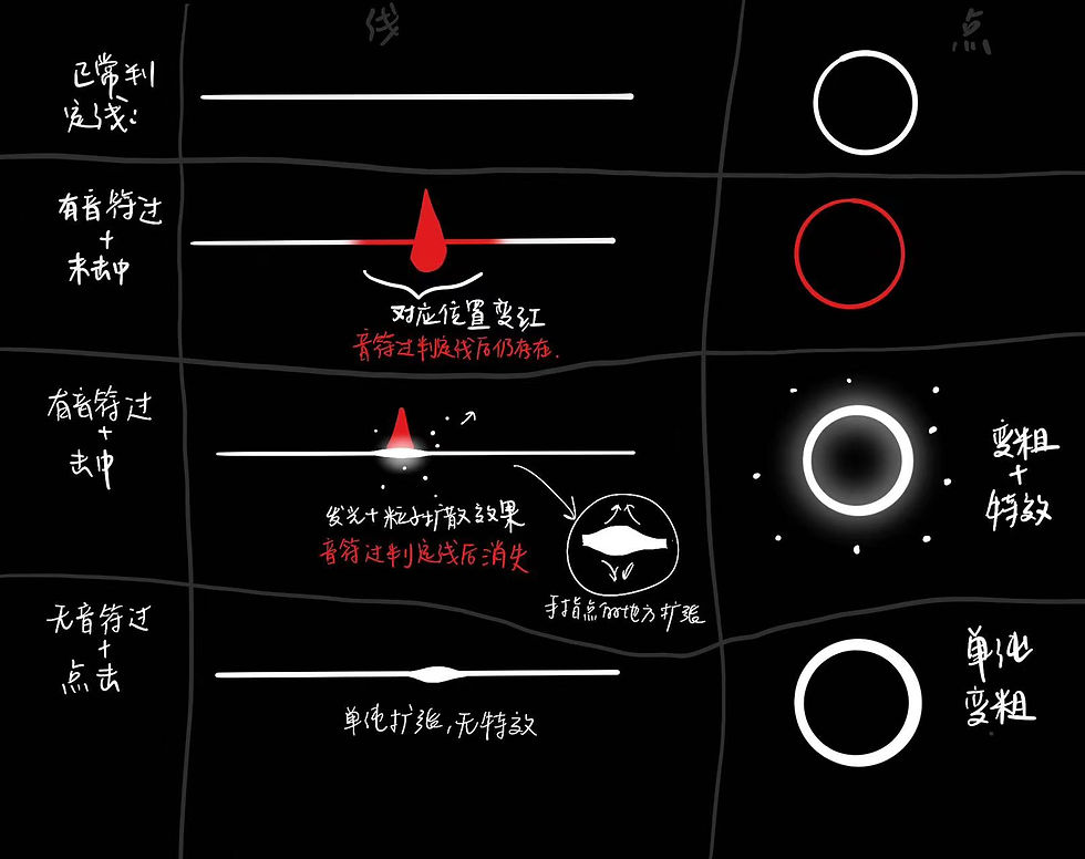
After making changes to the appearance, the initial interaction design no longer worked. So, I redesigned the interactions.
Comments